
Libra (iOS App)
Powered by a smart-scheduling algorithm, Libra is a to-do app with mindfulness at its core.
Typical productivity apps often try to address human productivity as an issue of time, but what is missing is attention to our focus, which ebbs and flows as we go about our day.
Libra’s mission is not just to generate the initial inertia is get our days started but to keep us moving throughout—to change the way we think about our tasks and approach our days, especially during this era of working from home.
Roles
UX Research, Ideation, Interaction Design, Visual Design, Prototyping
Tools
Sketch, InvisionApp, POP by Marvel, Adobe Illustrator, Miro, Principle
Timeline
July - December
2020
Team
One-person project, part of Springboard’s UI/UX Career Bootcamp
Overview
Since March 2020, almost twice as many employees have begun working from home as in the office. Every other conversation with my peers at time of research dealt with this conundrum.
From these conversations of empathy and support came the incredible opportunity to design a better way for my users to manage their days in pandemic-afflicted society.
Problem
The spatial and chronological parameters of “work” that have been set for us were shattered by the pandemic.
With it went the daily structure on which we had been hanging our lives.
This results in decision paralysis, a lack of satisfaction, and an inability to focus on work the entire time.
Solution
After extensive qualitative research (further detailed), I ended up with Libra, a to-do app that aims to do two things: take the energy out of deciding what to do, and reorganize the way we think about our tasks and our focus.
Just scanning? Click the titles to jump to each section!
Discover
Methodology
Target Demographic
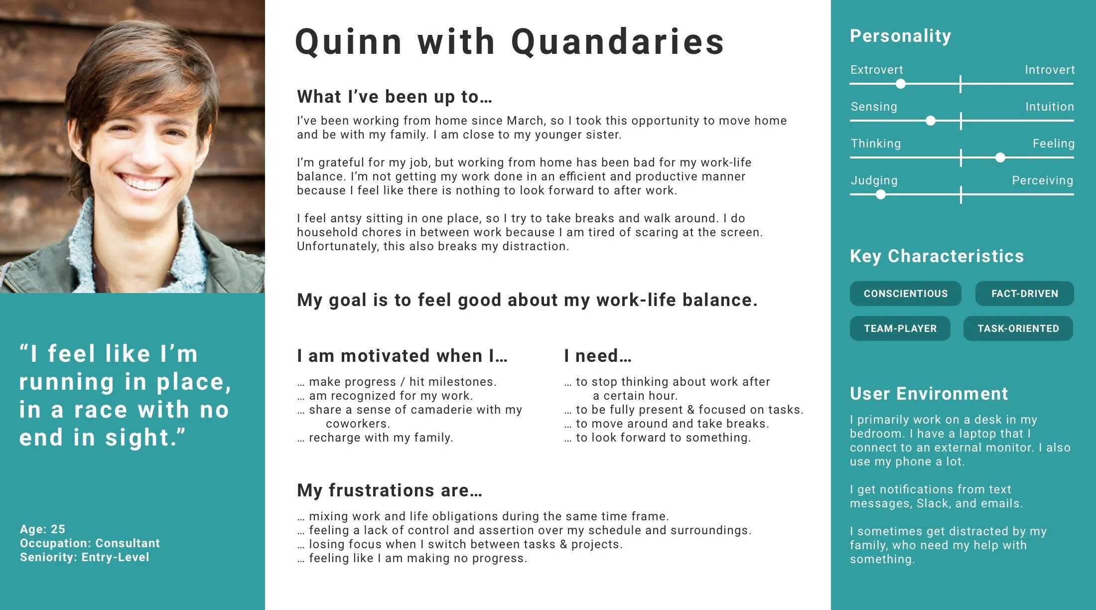
For research and testing, I focused on recruiting young working professionals.
Target users are those who would be easily introduced to a new technological solution. Millennials stand out for their usage of technology.
Within the group, I was looking for those who had begun working from home for at least 2 months, but no more than a year.
Users in transitory phases likely experience more discomfort & need support. People who already work remotely may have already adapted to their situation.
I recruited users who reported a disruption in either their work-life balance and/or productivity.
That’s what Libra is trying to address, after all!
Survey Findings
What has been the change to your work life balance while working from home?
What are the top three issues you’ve encountered during work from home?
Are you more or less productive working from home than in the office?
User Interview Objectives
Define…
… what work-life balance means, both before and after switching to working from home.
Understand…
… the underlying reasoning that drives their decisions behind how they separate work from life.
Identify differences…
… between workplace and home that make one or the other more conducive to productivity
Discover how…
… users manage their time and tasks when working from home.
What People Said
“I feel unproductive when I do home-tasks in between work. I mean… it’s technically productive, but still…”
— M.L.
“It’s just hard because there’s less of a distinction between when work ends and life begins, you know?”
— M.E.
"I don’t know. I begin my day and sit at my desk, but it’s hard to get past the initial inertia of setting things up.”
— R.F.
Define
Core Insights
Old habits die hard.
Our users still hold themselves to the idea of a traditional work-day despite the lack of infrastructure.
Cognitive dissonance arises.
Doing chores during work hours feels “unproductive” because it conflicts with the traditional work-day.
Breaks can be “productive.”
Our users have been doing household chores in between their work tasks as a “productive” break.
A sense of progress is important.
Celebrating milestones is satisfying to our users because they want to make progress.
(Curious how I got there?)
Affinity Map
Empathy Map
Constraints & Challenges
It is important to look at problems that specifically arose from working from home and not get distracted with problems that arose from the pandemic or the quarantine.
ie. “I can’t see colleagues in-person because of the pandemic.”
I was aiming to focus on problems that could be alleviated with a digital product rather than issues with technology itself.
ie. “Zoom meetings aren’t the same as in-person meetings.”
It was that important to allow users to plan their day of tasks without making the process feel like a meta-task in and of itself.
What I didn’t want was for this app to become another way of micromanaging the day.
The Problem
How might we…
… become more motivated about working from home?
… feel more in control of our schedule/surroundings?
… find harmony in accomplishing both work and household tasks?
… take breaks from work without diluting their focus?
… get a sense of progress (in both work and life) during WFH?
The goals in our statements seemed to interact with each other, and it turned out that perhaps the best way to move forward was to focus on finding harmony in accomplishing both work and household tasks.
Ultimately…
All of the goals in our statements seemed to interact with each other, and it turned out that perhaps the best way to move forward was to focus on finding harmony in accomplishing both work and household tasks.
This would allow users to hopefully feel more in control, take breaks, and get a sense of progress.
How might we find harmony in accomplishing both work and household tasks?
Develop & Design
User Flow
Libra: App Walkthrough
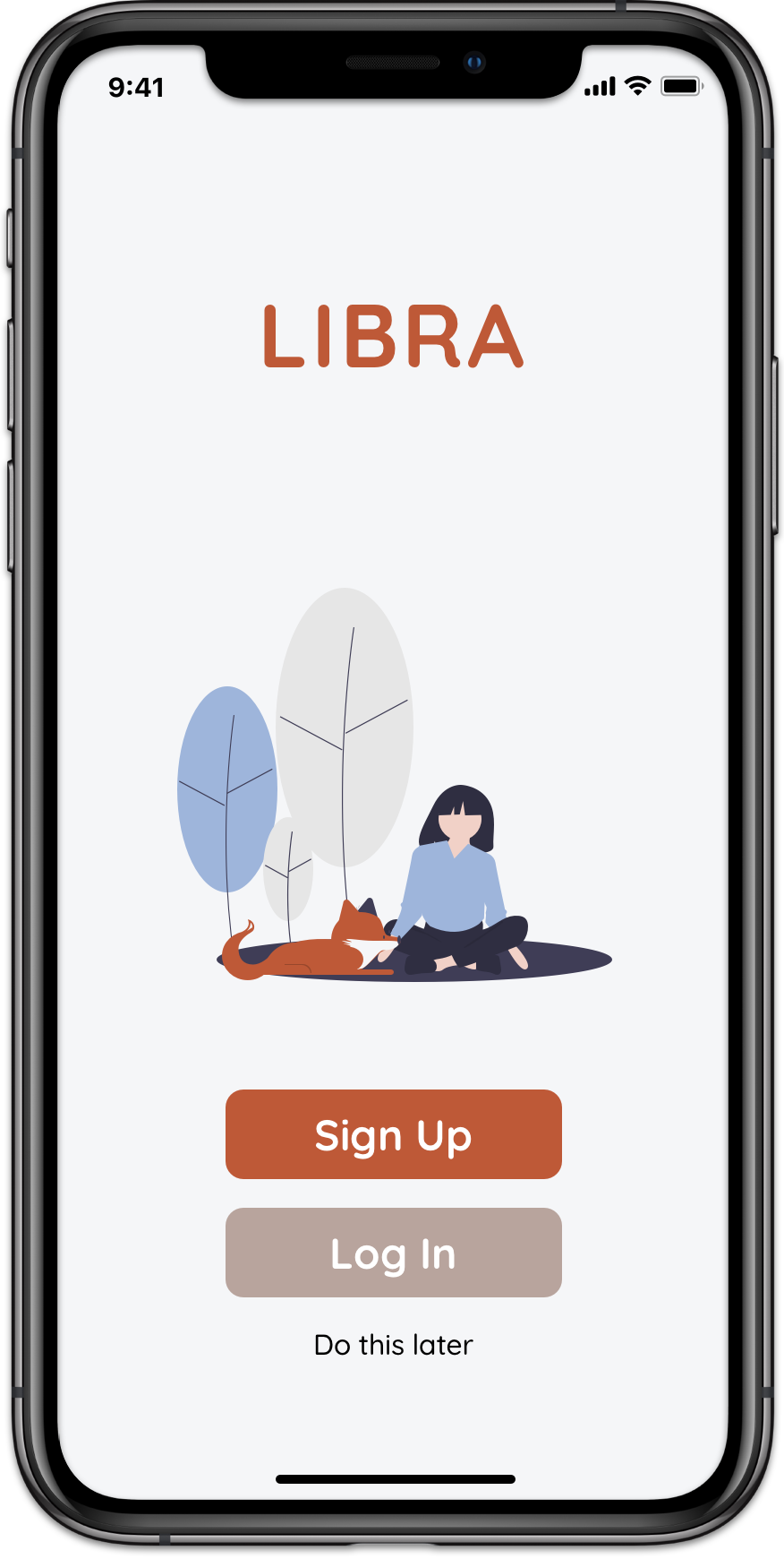
Splash Screens
UX Writing is Important!
The splash screens had to make a good impression, but they should also help establish an understanding of the app, namely smart-scheduling. Libra wasn’t just about getting users to do something; it also had to make an argument for the underlying logic behind the product.
The key to mindfully going about our day is to pay attention to our focus rather than the time.
However, even when the splash screens were skipped, users were able to understand the premise of the app.
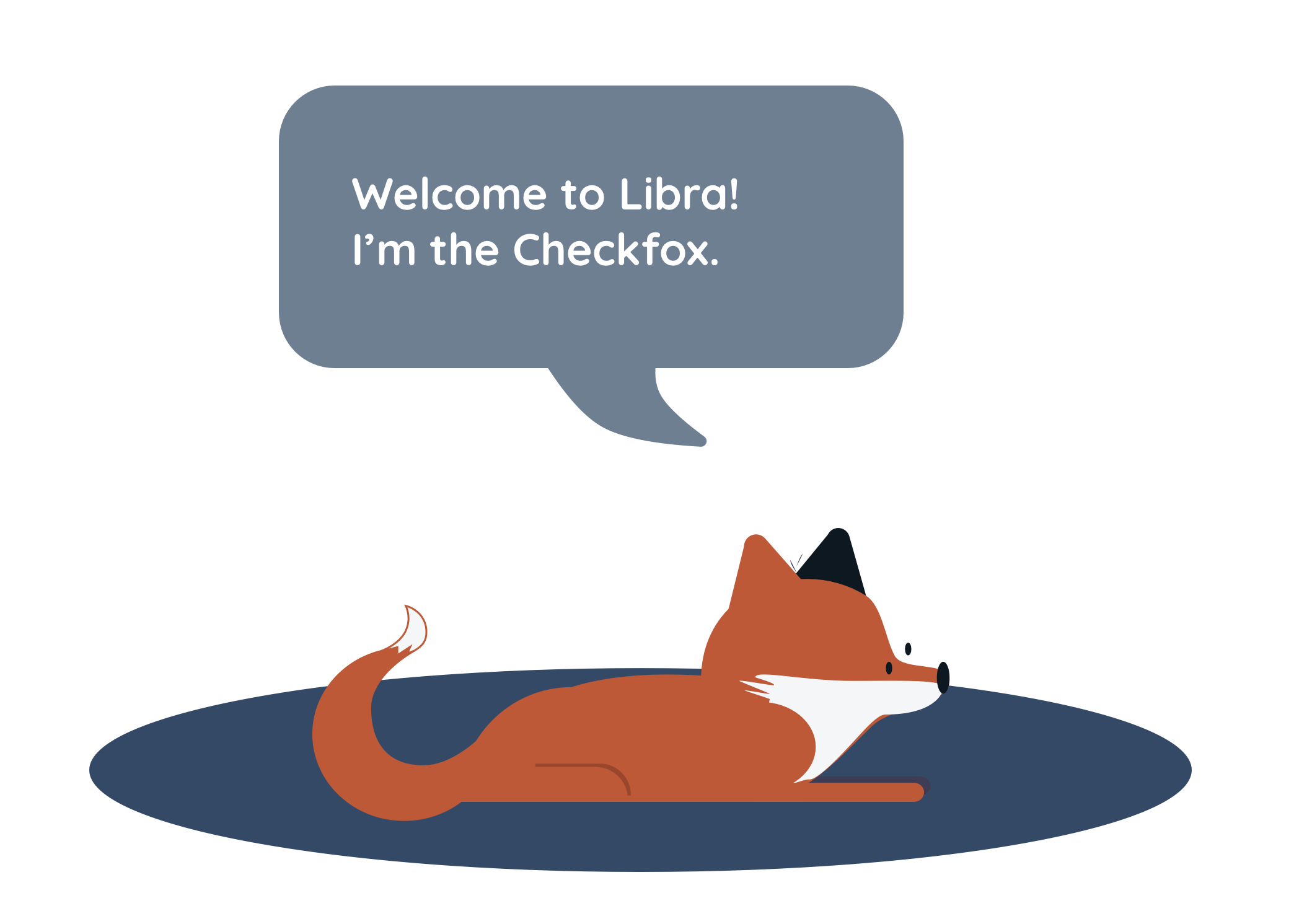
Friendliness through Design
The illustrations, combined with the rounded font, helped create an approachable atmosphere; it was important the users understood that the app was there to support them.
Adding a fox to echo Libra’s copper-toned logo also gave character and physical shape to an otherwise intangible scheduling algorithm. This created further buy-in from the users.
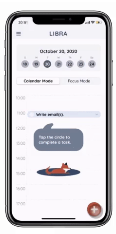
This fox also appears throughout the app as a helpful guide.
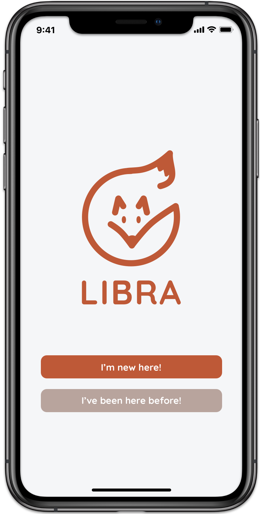
Onboarding
The most important part of the sign-up process is a short onboarding quiz that solicits information from first-time users for Libra’s smart-scheduling system.
Iteration 1
To not alienate users, a “Do this later” option was provided for those who didn’t want to divulge their personal information. However, this ran the risk of not getting the information needed in the onboarding quiz.
Iteration 2
The new screen not only had a higher success rate of getting users to take the subsequent onboarding quiz without expressing wariness, users were also more likely to sign up after the quiz.
By changing the language of the button to “I’m new here,” Libra became a lot friendlier and more welcoming the user with a get-to-know vibe.
Home Screens
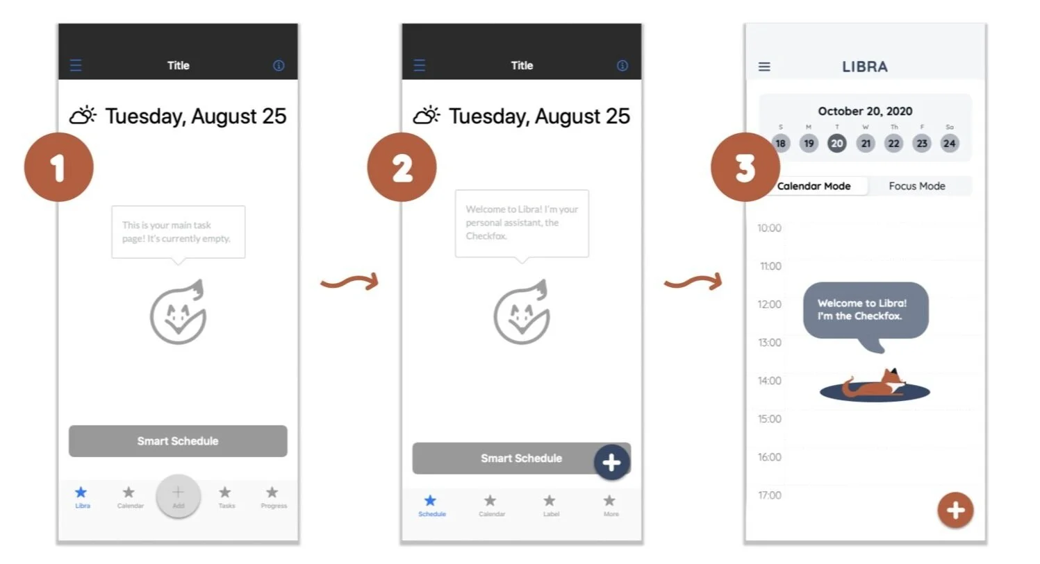
Less is More
A major challenge was getting the Smart Schedule function across to users, especially in a zero-state. An early prototype (See: 1) featured a prominent button that essentially shouted what the app was trying to do.
However, this inelegant solution proved to be just as ineffective. Users had no idea what the Smart Schedule button was for, and I ended up with two CTA buttons on the screen—the Smart Schedule & Add buttons. (See: 2)
After rethinking the MVP, I got rid of the bottom tab bar completely, in favor of a simple floating action button. I also integrated the most important components of the tab bar into a simple toggle. (See: 3)
I decided it was best to reveal the Smart Schedule through a combination of modals and animation, after the first task was added.
Floating Action Button
Though the floating action button is controversial from a UX standpoint, studies have shown that the slight negative impact on usability is only upon first usage—once users use the FAB once, it is actually more effective than the traditional action button. Since the FAB is such a core component of popular apps like those in the Google Suite & Twitter, it’s also safe to suggest the tech-savvy population are also quite familiar with the FAB now.
Additionally, more recent research have shown that the FAB “enhanced the ratings of hedonic and aesthetic features of the user experience.”
Task Qualities
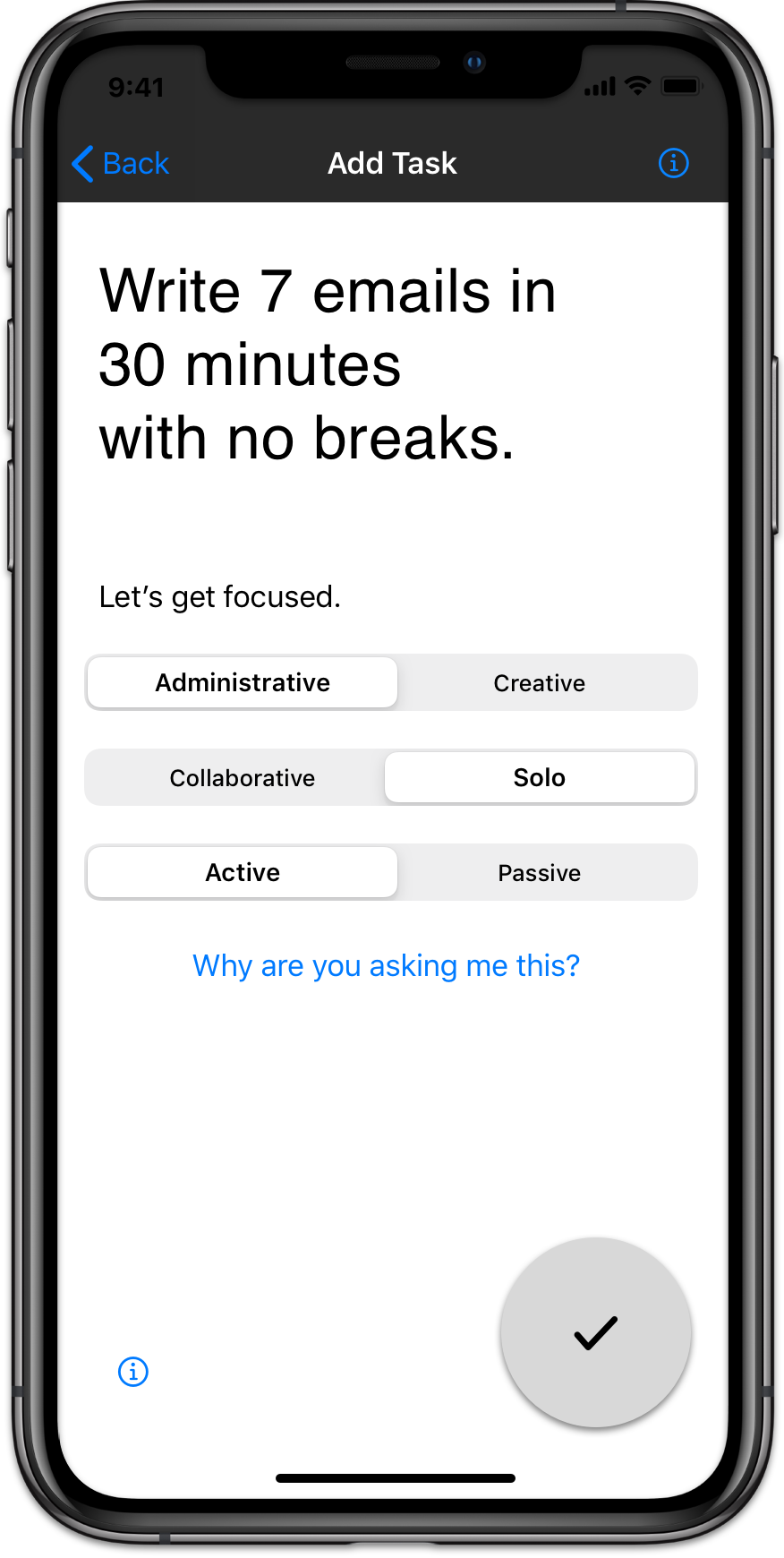
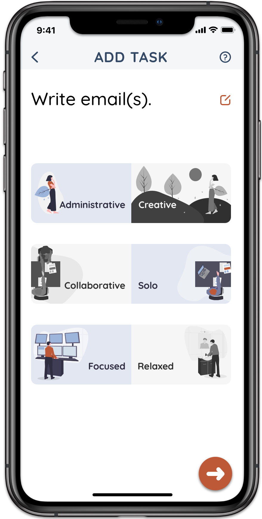
Libra’s main value add is the ability to “smart-schedule” your day based on how different tasks affects your focus, made tangible through Task Qualities.
Choosing & Testing Qualitative Differences
After thinking how various work, household, and leisure tasks interact with our focus, I chose three binaries that I felt best encapsulated the qualitative differences.
I was eager to test these assumptions. Users reported that the qualities were effective in helping them become more in-tune with the types of activities they were doing.
Intuitive Design
To make sure that the user would understand the different qualities, I’ve added parallel instructions to signal the relationship within each pair. The initial tutorial walks through the different qualities, but there is also a handy help button at the top of the screen.
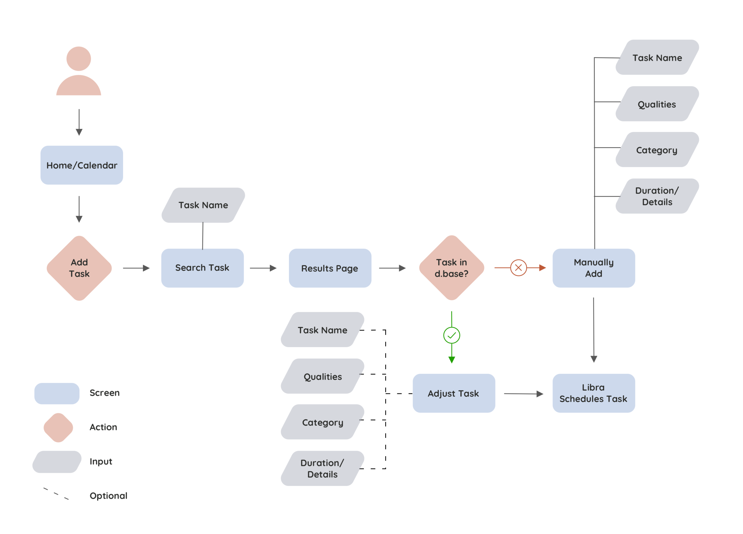
Add a Task
Database
Libra comes with a preloaded database of common office tasks, household chores, and leisure activities. If the task is not in the database, the user can manually add it and tag it with the appropriate details.
Order Matters!
After selecting or manually adding a task, users are asked to tag their tasks with qualities and have the option of adding additional information.
However, it turns out that something as simple as the order of what is asked of the user changes what they pay attention to.
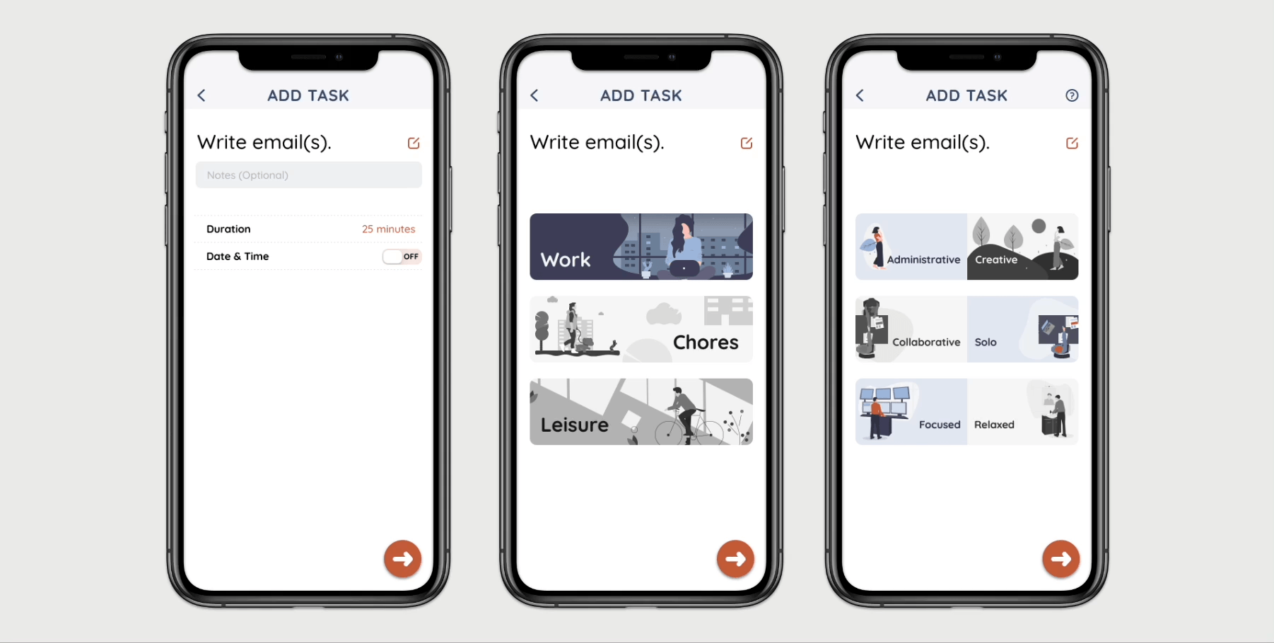
Iteration 1 followed that of many to-do list apps (Apple Reminders, Microsoft To Do, and Todoist) where users were immediately given options to provides logistical details like a date & time for a task. Then, I added the screens about categories and qualities.
However, users were most likely to fixate on locking in a date/time (thereby foregoing the Smart Schedule function); in follow-up questioning, many of them even forgot about the Qualities.
In Iteration 2, the details screen was moved last.
Users again forewent the Qualities, fixating on the Work / Chores / Leisure screen instead.
Finally, in the ultimate iteration, I moved the Qualities screen first, ensuring that users would pay attention to it first.
Users finally paid most attention to the Qualities and also had the strongest understanding of the Smart Schedule algorithm.
A simple change in order of screens actually had the strongest impact on how much the user understood the app.
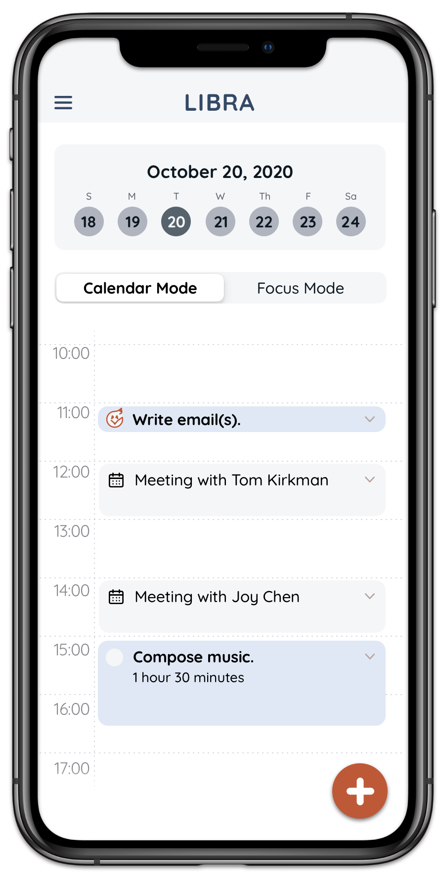
Sync a Calendar
Users, guided through the tutorial, were able to find the appropriate button for integrating their personal third-party calendars.
The ability to sync your personal calendars with Libra’s Smart Schedule is crucial for some of our users who also deal with work obligations and/or another primary calendar.
The imported meetings/events would be “static,” while Libra’s tasks would be “flexible.”
Adding Joy
In user interviews, our participants mentioned wanting to feel progress and to hit a milestone. The celebratory appearance of the cute little Checkfox and confetti made every user sigh—
Aww!
To make sure the users were able to get a sense of their productivity, I’ve opted to keep “completed” tasks on screen. This was initially not the case, but a few participants had mentioned that they would like this.
“Dude, I wish your app was real.”
— M.S., approximately 4 hours after testing a hi-fidelity prototype
Reflection & Next Steps
As with any project, UX is ultimately about keeping humans at the center of our work—listening, responding, and helping. In Libra’s case, it was also an interesting opportunity to take a closer look at users going through a monumental moment in history. The UX of this project aimed to stay focused on a historic number of employees working from home, yet it also kept its eye on a global pandemic that wreaked havoc in more ways than one.
I had to ask myself—at a time when users needed to get off the screens (see Fjord Trends 2019: Silence is Gold), was a digital hybrid wellness to-do app really the way to go?
The truth is that technology is embedded not just into our lives but in our social habits as well. The best we can do is to promote mindful design, which I’ve tried to do by purposefully drawing attention to the Leisure category on the app. I’ve had users note that after seeing Leisure as a category, alongside qualities like “Relaxed,” they realized they should better prioritize time for self-care.
To me, that’s a start not just towards work-life balance but also wellbeing.
Join us and see for yourself!