
CAMoMA (iOS App)
Description plaques at the museum don’t offer enough background information about the art, while the internet offers too much. Designed as an in-gallery companion for the MoMA visitor, CAMoMA empowers visitors to learn what they want, when they want.
CAMoMA makes use of object recognition, augmented reality, and clean design to provide users with instantaneous access to succinct and curated information so that they may leave the museum more informed and reflective than they entered it.
Role
Ideation, Interaction Design, Visual Design, Prototyping
Tools
Sketches for ideation; Sketch & Invision for Design & Prototyping
Timeline
November
2020
Team
One-person project, part of Springboard’s UI/UX Career Bootcamp
Overview
Over quarantine, beyond indoor dining and hugs, what I’ve missed most is going to art museums. Though fairly extroverted, I feel rather at peace amongst the artwork, engaged in a conversation that transcends people, places, and time. I’ve spent immersing myself in the color fields of Rothko and hearing Vivaldi in Cy Twombly’s Four Seasons.
Thus, for my first Design Sprint Challenge, I was excited to address a challenge that allowed me to reminisce about days gone by while actively working to…
Challenge Brief
… design a way to improve the experience of viewing art in a museum!
This a fairly high-level challenge brief that became further clarified after I took a look at the provided user research.
Constraints
The product should focus on improving the in-person experience, or how they experience art while looking at the piece in real-life.
The app should be mobile-optimal or a native app.
I also set some design constraints for myself by picking my favorite museum—the MoMA—and adhering strictly to its aesthetics and design system.
Just scanning? Click the titles to jump to each section!
The Google Venture Design Sprint
Day 1: Map
The goal was to learn as much as I could about the problem and to “start at the end.”
By Day 5, I will have answered…
What do visitors want to know about each artwork?
How much time do they want to spend on each artwork?
What is important to a better experience?
Then, I’d consult pre-existent research from experts and target users. In our case…
What do museum visitors say?
What does the museum tour guide say?
Visitors Behaviors
Spontaneous
Visitors don’t look for specific exhibitions; instead, they often browse around.
Succinct
Visitors lose interest in reading when information is too long or in-depth.
Informative
Visitors want to form their own opinion about art but find it hard to do so without knowing background information.
At Your Own Pace
Visitors prefer to tour at their own pace but may listen in on tours.
What the Museum Guide Said…
The typical visitor…
… doesn’t know that much about a piece of art. There are some who have done research beforehand and want to know more.
What resonate well with guests…
… are how artists grew up, why they became an artist, and whether there was a reason/method to their madness.
As a tour guide, the goal is…
… to help them create a story. Set up some of the original context so they have a better sense of the artist’s intentions.
By the end of the tour…
… the visitor should feel empowered to reflect on how they feel about art, but also artwork is also about understanding yourself.
How Might We…?
Based on what I learned from expert and user interviews, I brainstormed a few How Might We statements to guide my design process for the next two days.
How might we provide the most important background information & context without overwhelming users?
How might we create an engaged self-guided tour?
How might we empower users to form their own opinion about art?
Day 2: Sketch
Lightning Demos
A few ideas were already percolating in my mind, so in addition to museum apps, I looked to object recognition apps & apps featuring multiple modals.
I wanted to study museum apps to appraise the current market.
I downloaded the most popular apps on the App Store: Google Art, Met Museum, and Chicago Institute.
I wanted object recognition so that my app would be able to identify artwork.
I downloaded Seek, an app that identifies plant species, since that was a popular use of object recognition.
I wanted to see how compact modals were used to succinctly present information.
I downloaded Joss & Main, a sponsored furniture catalog, since I knew those would likely have compact modals that would expand into cards!
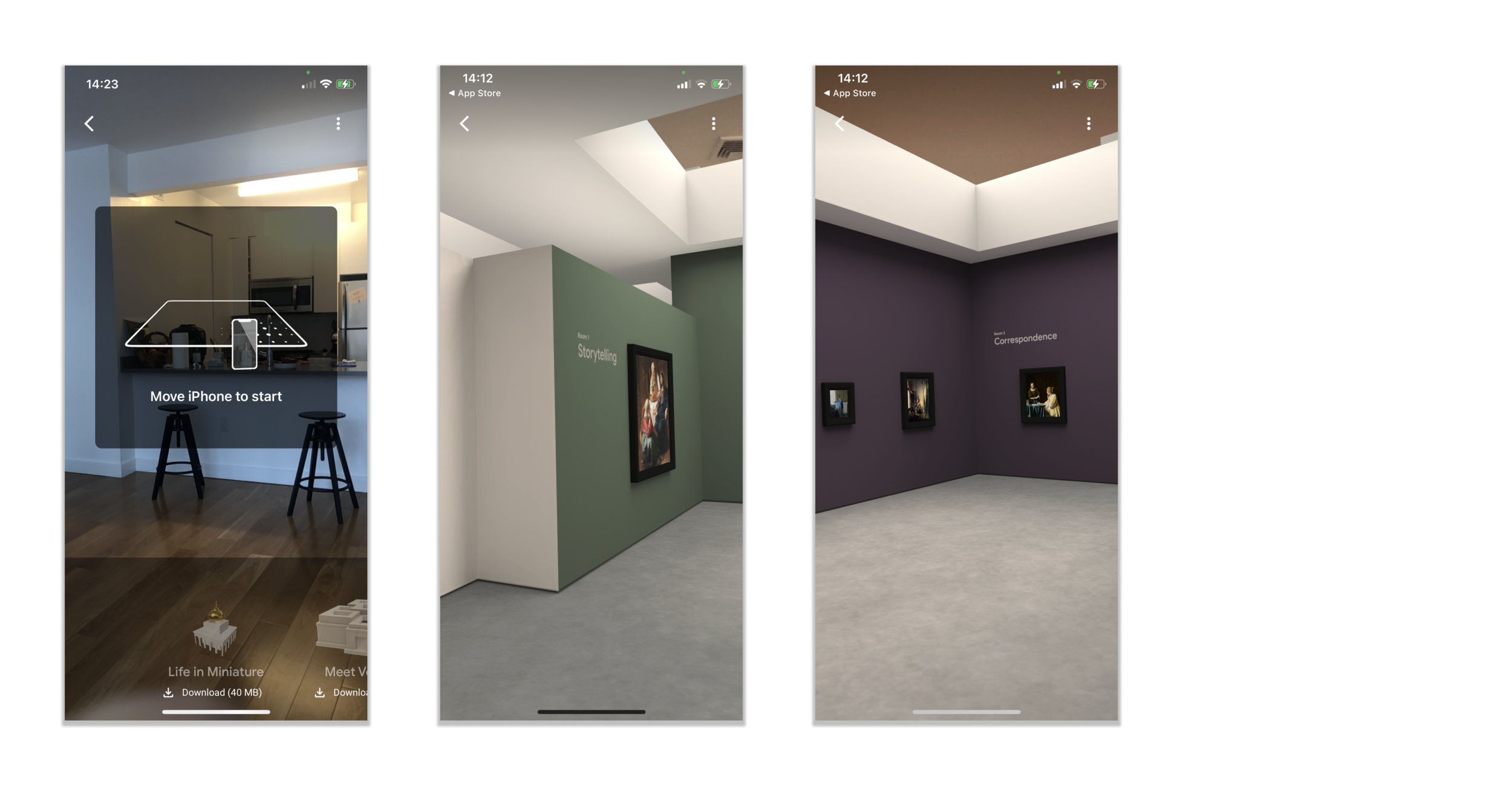
Augmented Reality: Google Art
The Augmented Reality component of Google’s app makes use of the user’s surroundings to fully engage the user.
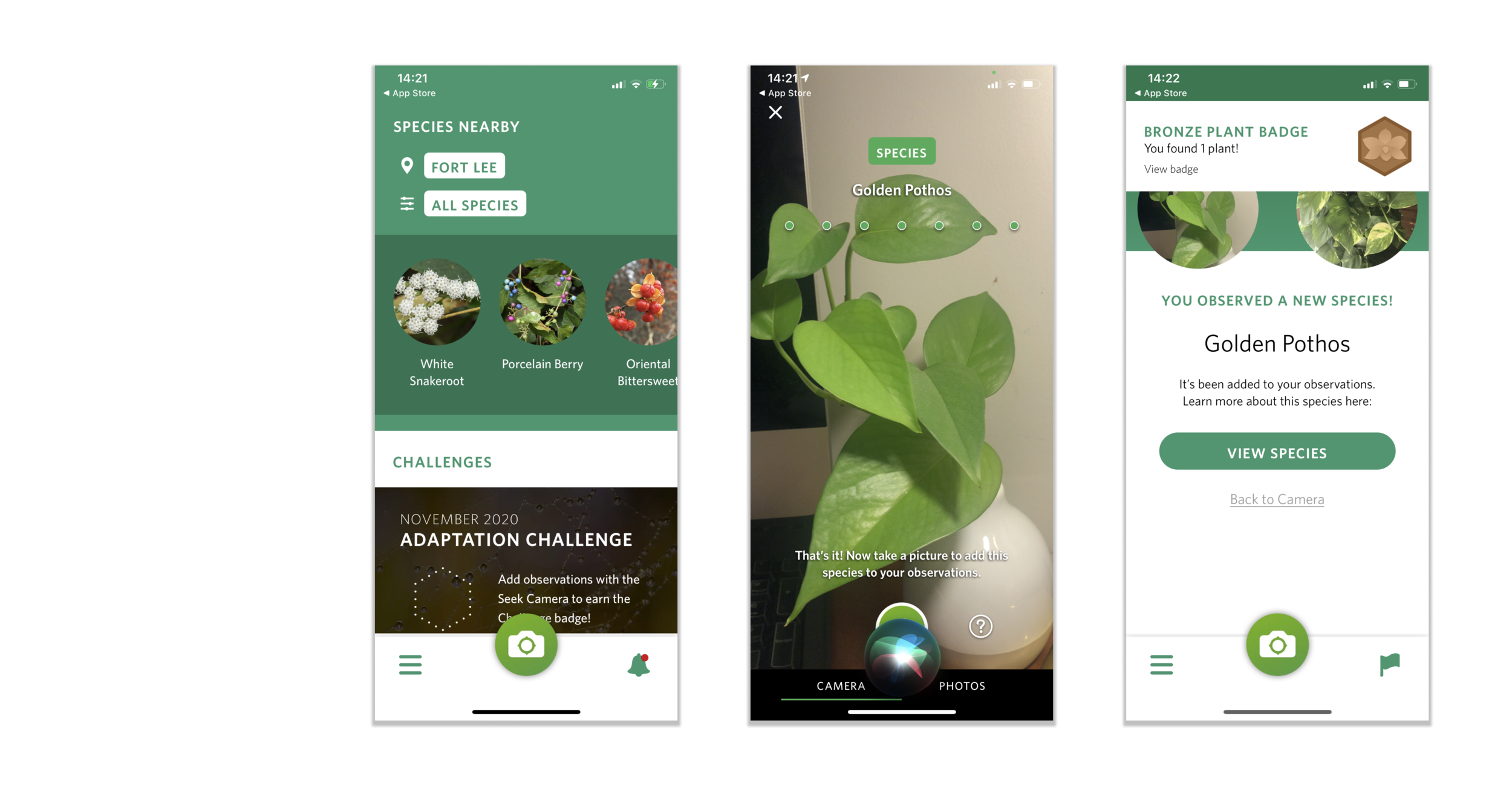
Object Recognition: Seek
The prominent camera button declares the app’s functionality.
The helpful prompts that appear on the screen also teach the user how to take proper pictures for object recognition.
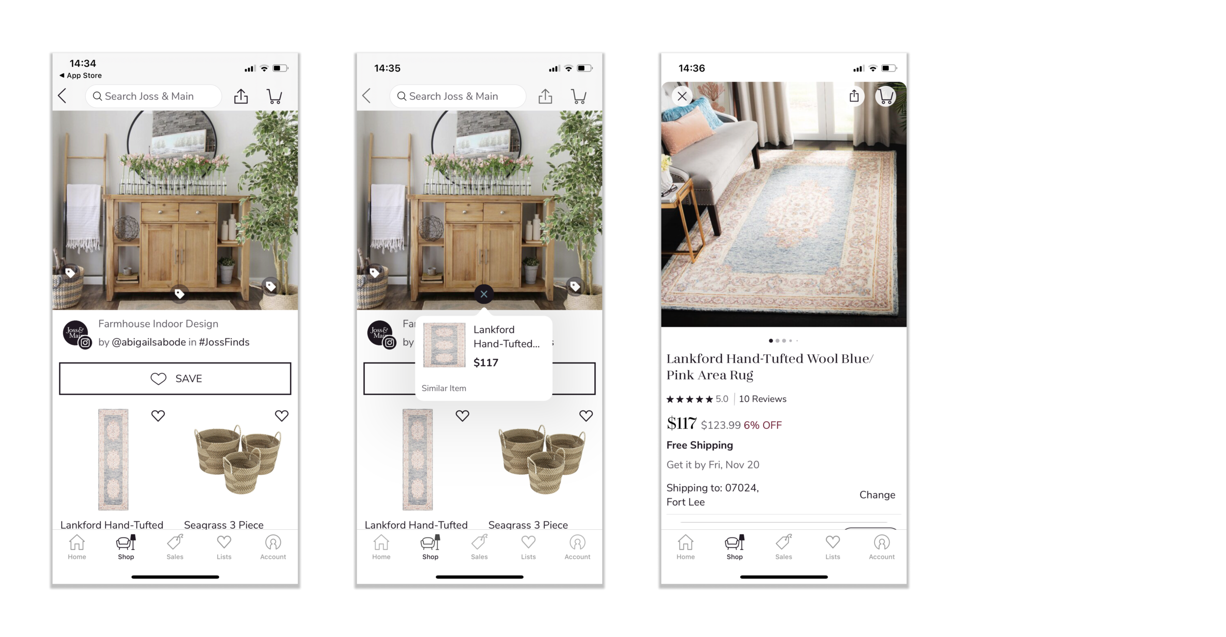
Modals & Cards: Joss & Main
The overlaid icons are uniform and noticeable without detracting from the image.
Clicking on the small pop-up modals lead to the product’s main page for more in-depth information.
Synthesis Sketch
By the end of the competitor analysis, I was already quite inspired.
I incorporated core elements from the different lightning demos.
Here were more of my ideation sketches from my Crazy 8 exercise!
Day 3: Decide
For the purpose of this sprint, I decided to focus on designing an experience where a user would be able to
snap a picture of an artwork, and
access additional information about the artwork quickly.
My design wish list included:
screens to help orient the user in using the object recognition feature.
easily collapsible modals and cards with short text as to not inundate users with more information than they ask for.
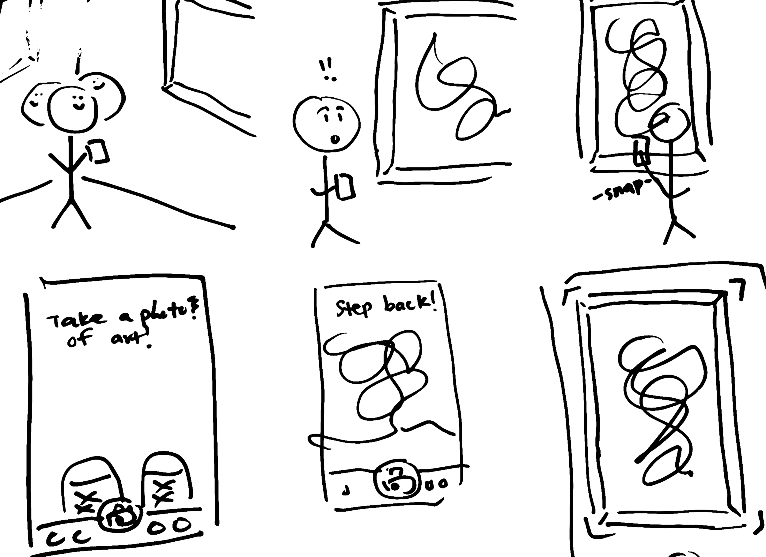
I expanded on my storyboard sketch from Day 2 to envision the setting and situation in which my user would use the CAMoMA app. I converted this into a user-flow to better guide my wireframe designs.

Day 4: Prototype
Understanding MoMA
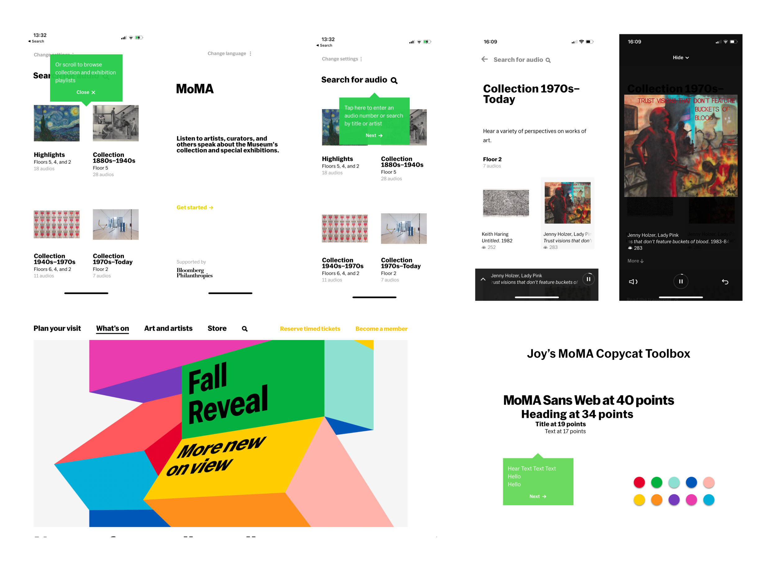
I wanted to challenge myself to work with a pre-existent brand, so I chose my favorite museum, the MoMA.
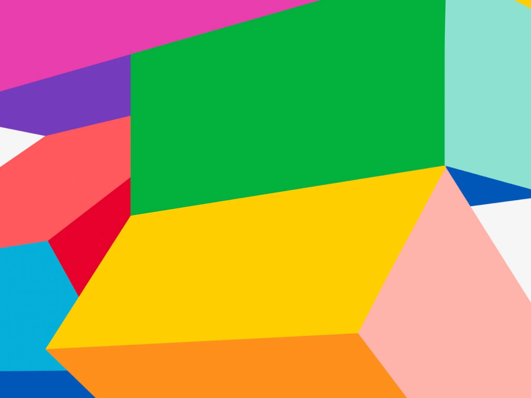
For inspiration, I took a look at their website & mobile app. I collected screens that I felt best encapsulated their distinct minimalist vibe. After that, I put together a quick design system using their fonts, modal styles, and colors from their particularly vibrant Fall 2020 campaign.
AR Orientation
Familiarity
A few users who saw these screens during testing exclaimed that the screen reminded them of Snapchat.
For our less social-media-oriented users, I also modeled the shutter after the familiar Apple Camera shutter.
Textual & Visual Prompters
A la the Seek app, I included helpful prompts to orient users to the app’s Object Recognition feature.
Once the camera picks up on a piece of artwork, AR elements, like a highlighted border and an animated shutter, would prompt the user to snap a photo.
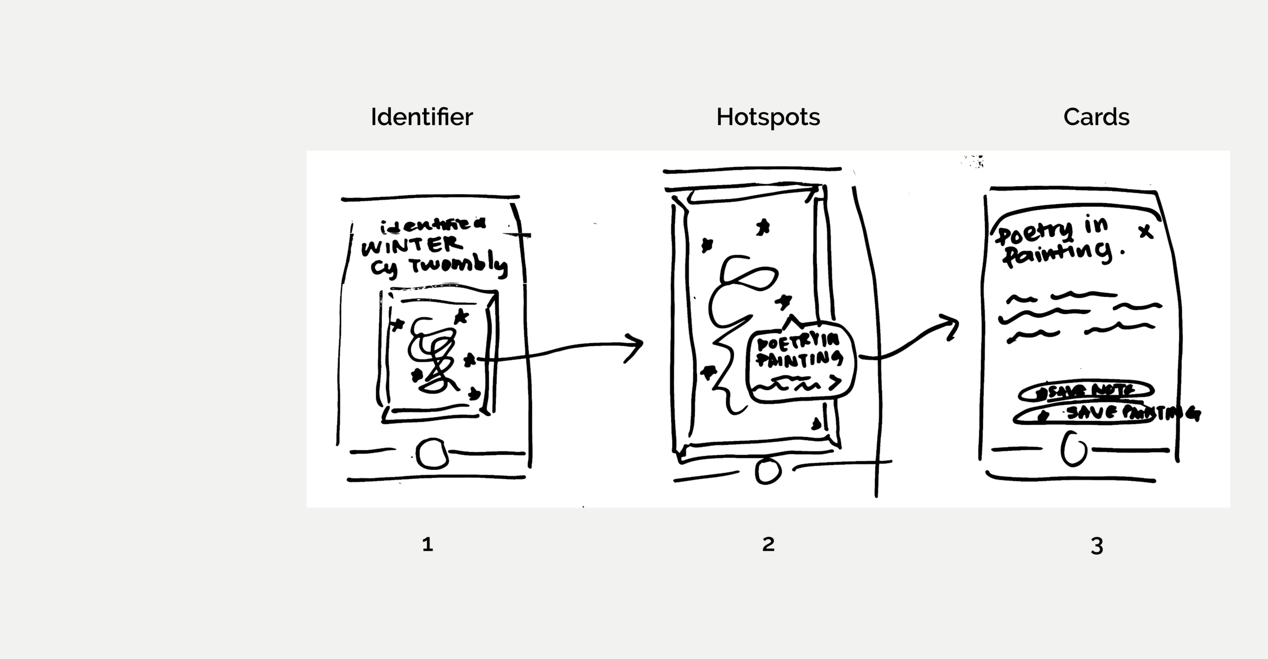
Hot Spots & Iconography
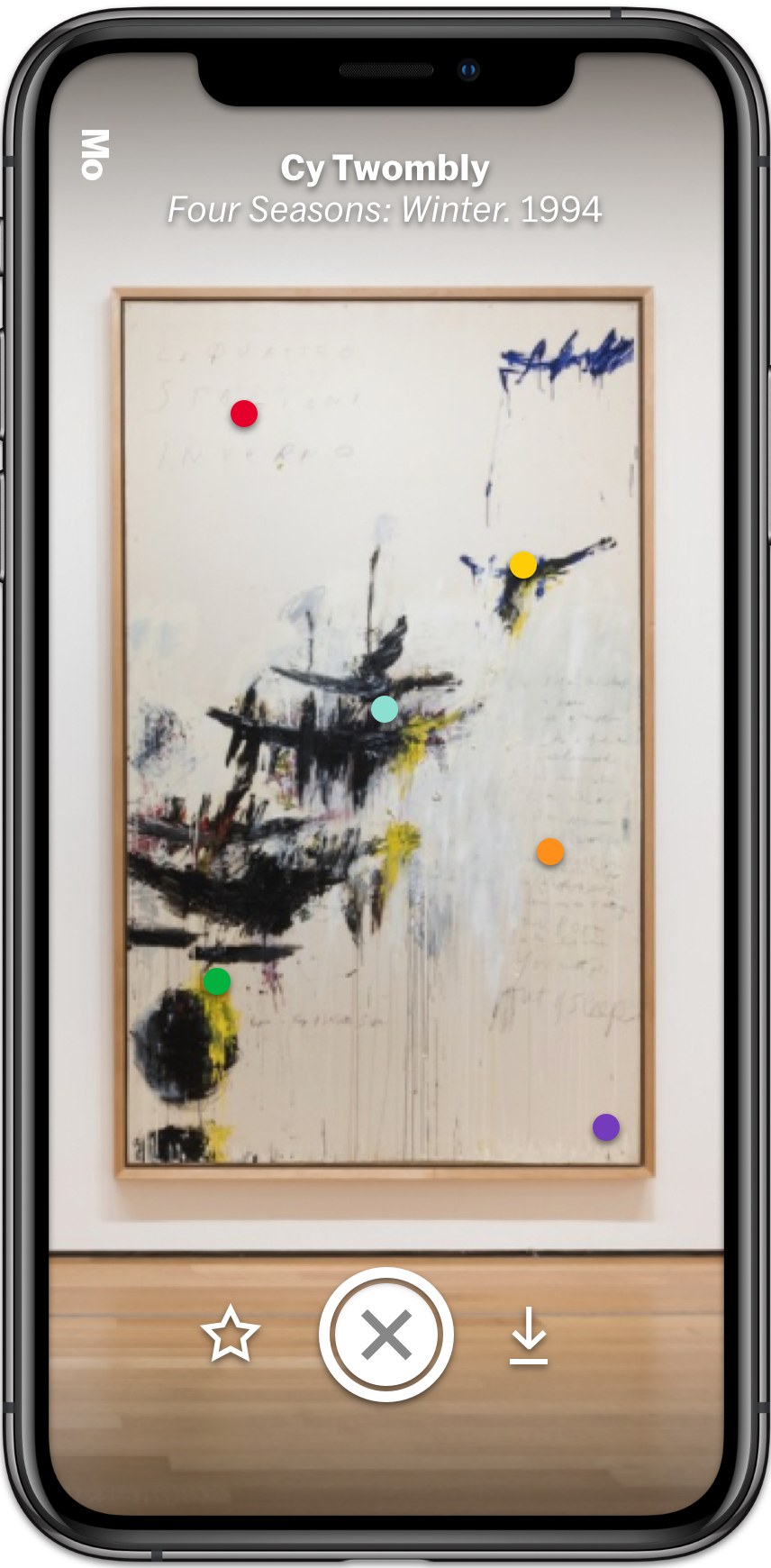
Once the artwork is captured, the artist, title, and year appear.
Iteration 1 (Left)
The original design featured smaller colorful dots since I did not want to detract from the paintings. The downside was that it was not very clear what the dots were referring to.
Iteration 2 (Right)
I increased the size of the hotspots and imposed icons onto them as a pictographic indicator of what each hotspot would trigger.
Though this was better UX, it still wasn’t perfect. Not all users have the same understanding of the meaning of an icon. Additionally, I also used a generic icon set that was not curated for the museum.
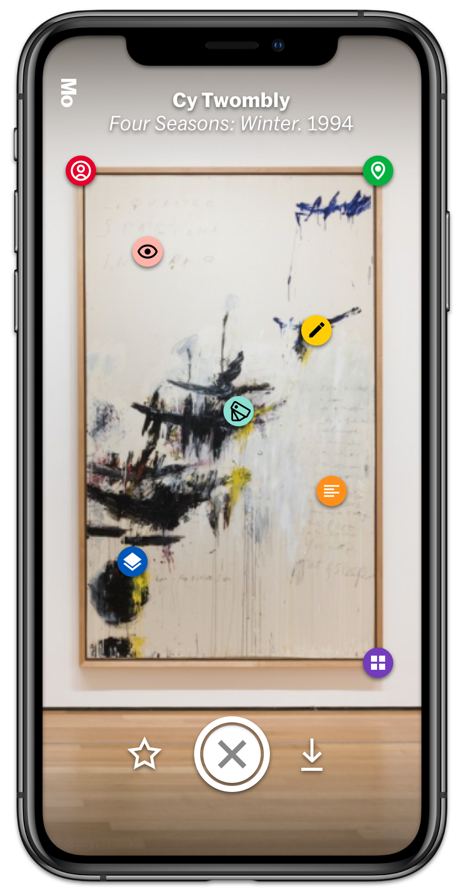
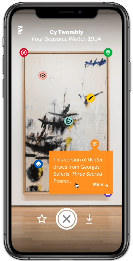
Modals & Cards
Tapping on each icon pulls up a small modal in a corresponding color.
Tapping on the modal itself expands it into an overlaid card, out of which is also easy to exit.
The text and corresponding background colors have been tested for readability.
The iconic bright color scheme also helped to establish the MoMA brand.
(Fun Fact: this particular bit about poetry came from an art research paper I did at Princeton!)
Day 5: Testing
Process
For testing, I posted a quick poll on Instagram, asking my followers if they went to art museums. I tested those who responded Yes.
Since this was a quick prototype, I wasn’t able to replicate the exact experience of having a camera identify a random piece of artwork, but I let them play around with the prototype to mimic the exploratory, self-guided purpose of the app.
Findings
I paid particular attention to user behaviors regarding:
orienting themselves with the object recognition functionality.
taking a picture of the painting.
exploring the modals.
expanding and collapsing the cards.
The users ultimately enjoyed the app due to their familiarity with the Snapchat-like interface, but they had some concerns about what the icons represented. They also weren’t entirely sure about the placement of the icons.
I suspect there would be lots of room for creating further engagement by working directly with a museum’s database of information and expertise.
Reflection & Next Steps
Ultimately, the purpose of a sprint is to rapidly generate a lot of ideas. While this process needed to be adjusted for a solo sprint (as opposed to brainstorming or workshopping with a team), it still provided great opportunity for me to innovate within a fantastic framework.