Airsip (iOS & Android)
Airsip is a social network platform where users can ask and answer questions through short videos.
Brought on as the team’s only UI/UX Designer, I used design processes to also make informed decisions re: Product Development and Business Strategy.
Roles
UX Research, Visual Design, Product Design, Branding
Tools
Figma, Figma Mirror, Notion, Discord
Timeline
March - May 2021
Team
CEO, CTO, a front-end developer, and 2 back-end developers
Overview
“Reddit + Tiktok = Airsip.”
Currently, the most common form of high-value information dissemination is through text, ie. forums and email, excluding experiences that cannot be shared through text (like dance and athletics).
Targeted at college students and pre-professional communities seeking advice & support, Airsip uses engaging short videos to provide a platform to share the information users want and need.
Problems
The app was released in December 2020, but MAU had dropped 50% as of March 2021.
The team had ideas and developers, but there was no structure or consistency in design, resulting in poor usability.
Solutions
Design a viable sharing feature that would attract new users by providing limited access to content.
Increase trustworthiness & security through better visual design & branding.
Just scanning? Click the titles to jump to each section!
Alignment
Heuristic Product Evaluation
Defining the Problems
Product Development
UI/UX Design
User Acquisition Strategy
Usability Testing
Collaboration
Agile, but Adjusted
Design System
Business
YCombinator Application
Alignment
Heuristic Product Evaluation
Before I met with the CEO, I downloaded the app and conducted a heuristic evaluation using Nielsen’s Heuristics & Gerhardt-Powals’ Principles.
Defining the Problems
Aesthetic Usability
From color to iconography to font, there was no visual cohesion across the app. Judgments on credibility are 75% based on overall aesthetics.
Accessibility Issues
Some screen readers cannot read placeholder text. There were also some color contrast issues with the text and iconography.
Empty States
Users are met with empty states when they first land in the app. Though there are error messages, we should work to prevent the empty state in the first place.
User Control
Because Airsip relied on accelerators like touch gestures to exit certain screens, there was no clear way to exit some of the core interactions.
Product Development
Branding

An in-depth chat with the team unveiled:
Apps that inspired…
Reddit
Tiktok
(early) Instagram
Reflectly
Values that motivated…
Personal
Genuine
Inclusive
Equal
Adjusting the pre-existent brand
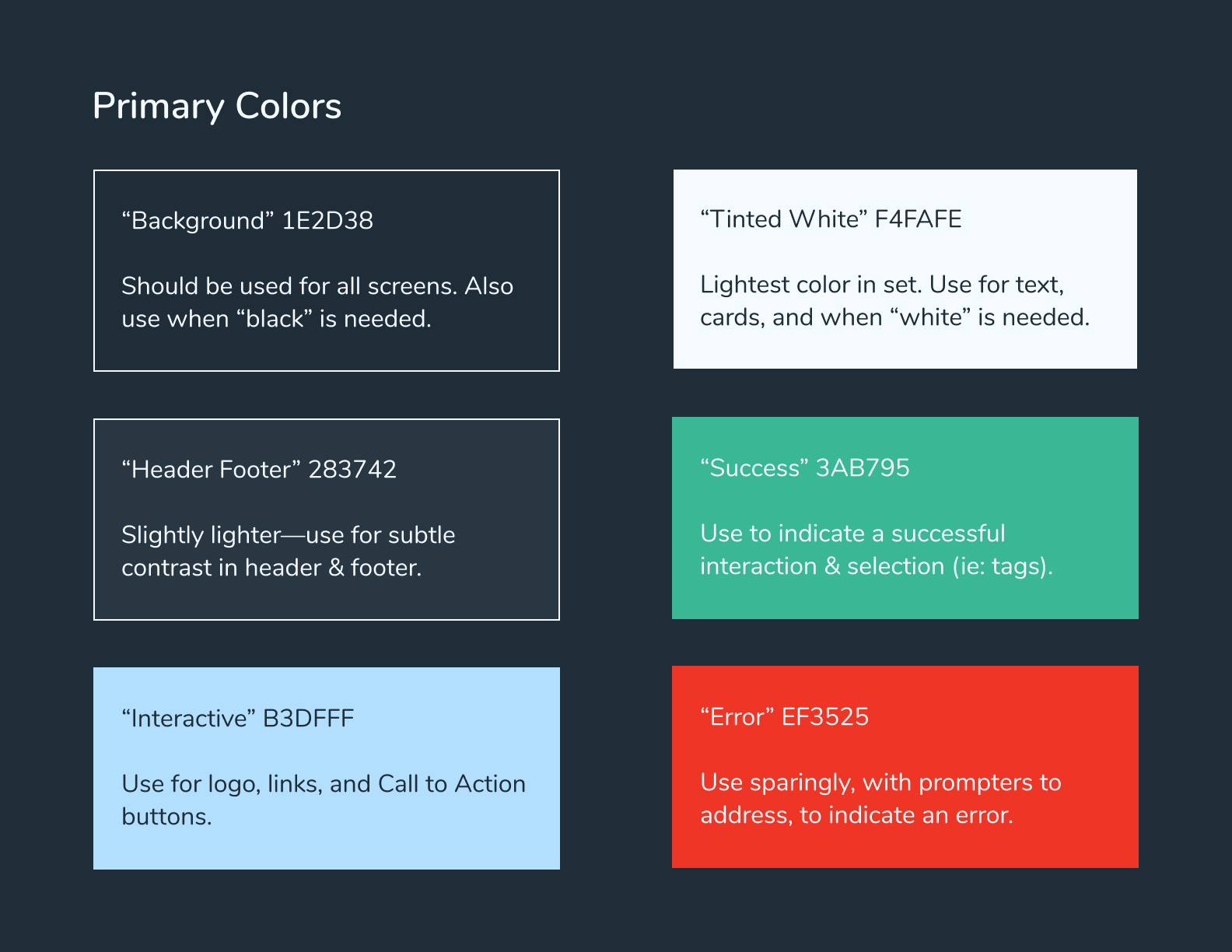
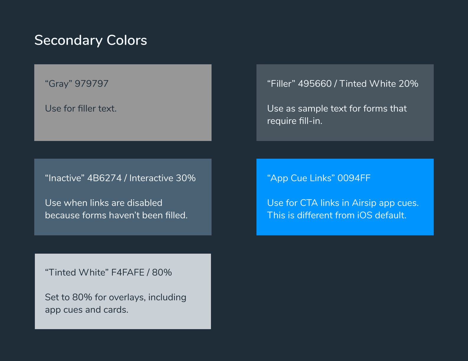
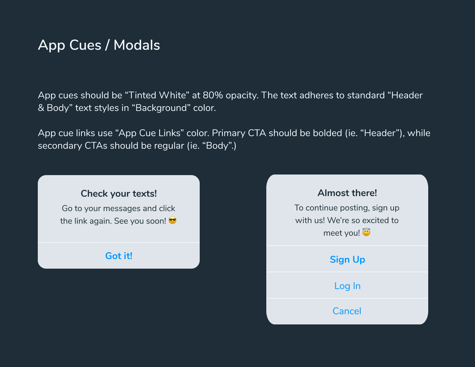
I knew we had to keep the color blue. However, the blue & white interface, albeit a very popular combination, felt too “harsh.” The designs they had conjured up LinkedIn, Microsoft, and Twitter—they didn’t conjure up Airsip.
Thus, I made three main adjustments:
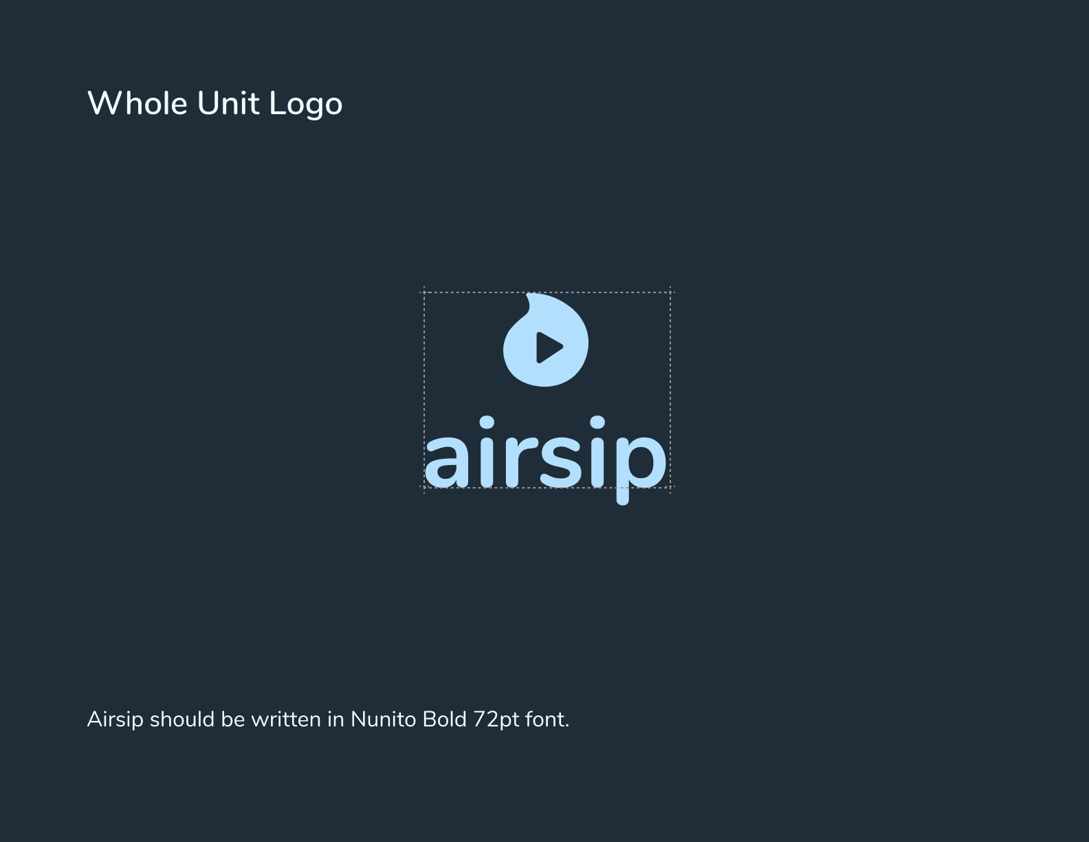
Going Dark
Softens the hyper-professional blue.
Not just a UI trend, but a behavioral one as well.
Rounded Font
Contributes to a friendlier personality that invites inclusivity.
Simple Color Scheme
Keeps everything visually cohesive and confident.
What does the app do?
As a sneak peek before we launch into select screens and flows…


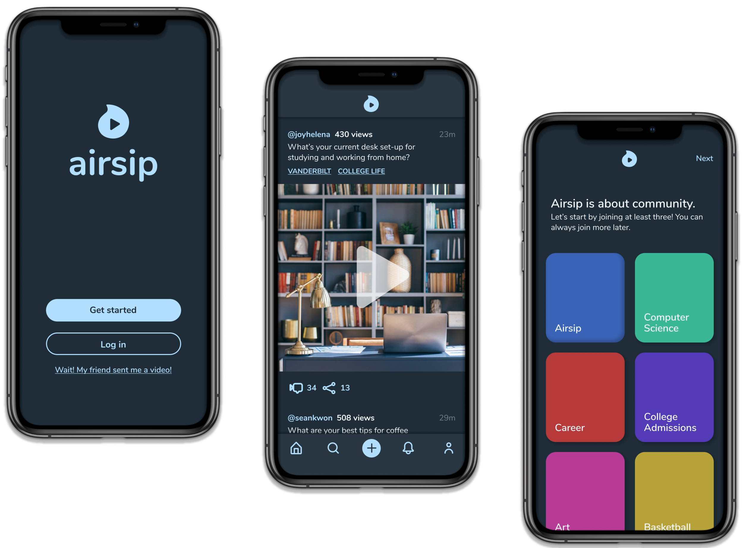
Onboarding

Community First
To prevent users from seeing an empty feed, I pushed community selection to the front of our onboarding. (In a previous design project, I learned that users paid most attention to the first screen in a sequence.)
My competitive analysis of other community-selection patterns included Tumblr and Meetup, both of which featured attractive colors and/or images to engage users.
Mobile Sign Up
I’ve spent a good chunk of my professional career in Beijing, where behavioral patterns evolve very, very quickly due to the scope & scale of action the tech giants are able to take.
In Asia, most products, from food delivery to e-banking, are actually bound to a mobile number.
Airsip originally had an email & password sign-in, but I opted for the phone number sign-in to keep the modern feel of the app.
I also divided the process up so the user would not feel overwhelmed.
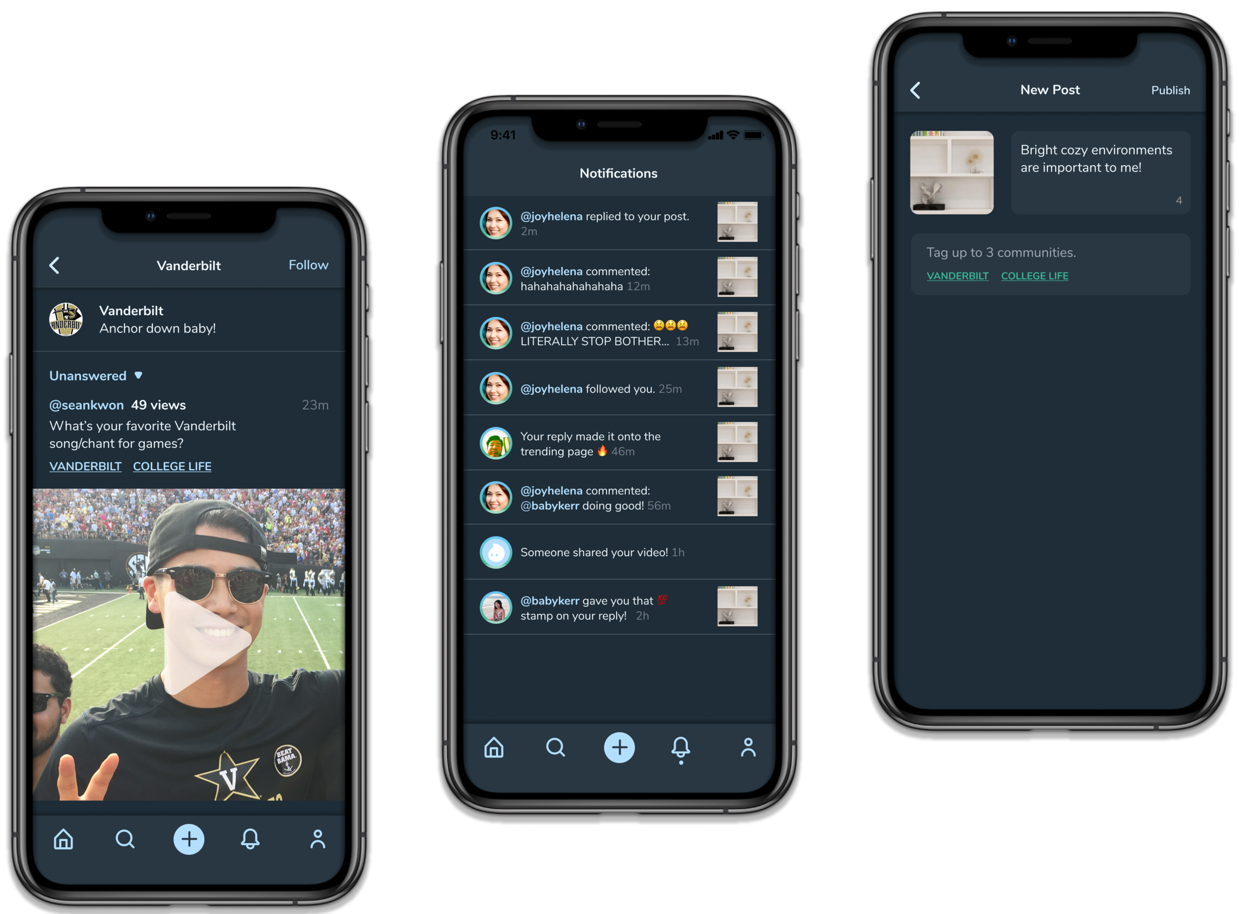
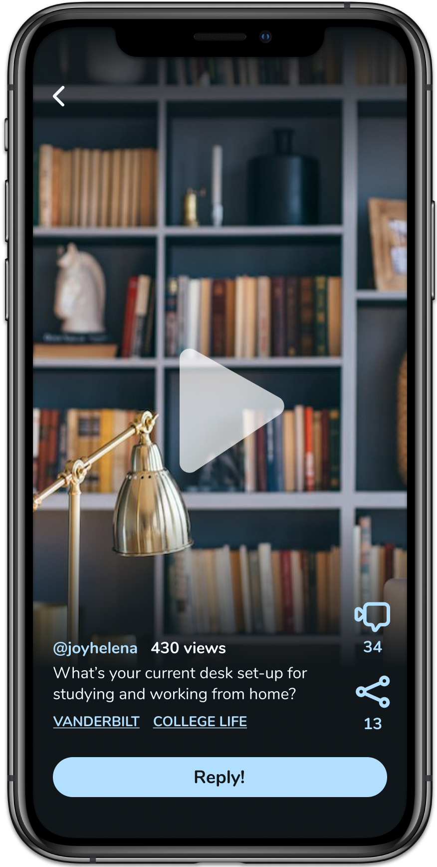
Core Screens


These “main feed” screens were important to get right since they would serve as the template for other flows. My first designs (LEFT) were focused on translating Airsip’s previous screens into the new design system so that we could test a cohesive prototype.
Text Hierarchy
Since Airsip was a community app, I initially wanted to highlight the tags in my design. However, during a design presentation, the CEO noted early growth would be driven by first-degree connections like friends & family.
I adjusted the text hierarchy so that the username would be more prominent than the tags to emphasize the individual.
Pattern & Icon Grouping
In the first design, users didn’t know that the trio of icons were clickable. I suspected that VIEWS, or the nonclickable “eye,” was what threw users off.
I ungrouped the icons and decided to present VIEWS in a different way. I also adhered more strictly to my design system to “teach” users that only elements in blue would be clickable.
Though Airsip adhered to social media patterns, when the patterns were used improperly they caused more confusion than otherwise.


User Acquisition
We had a traditional new user onboarding flow, but to learn from Tiktok’s viral appeal, we would use acquire more new users through individually shared videos to engage first-time users.
As with Tiktok’s popular sharing feature, we want to attract users by giving them a preview of our content before asking them to sign up.
There were two problems with copying Tiktok:
It was far too expensive to have our content directly linked from the messages—as Tiktok does—as that would require videos being stored on a web-app/cloud.
However, the alternative—requiring users to download the app and going through the sign-up flow before seeing the video—would probably cause them to fall off.
How to get them to the content?
After a few product meetings and a lot of chaotic screen-sharing, we looked at how other products approached user acquisition, like:
Clubhouse’s Invite Only Model
Pinterest’s Limited Access Sign Up Flow
I proposed a happy medium that featured
a link that would take the user to the App Store
but also take them to the shared video, once downloaded.
a friendly hijacking of the flow to encourage sign up.
It turned out to be a tech issue we could solve with smart design.
We saw this reflected in the communication of the idea as well.
In a meeting with the CEO and CTO, I saw how communication broke down, and thus I designed a wire-flow to align everyone.


(Curious what five frantic minutes on Figma during a heated stand-up looks like?)
Usability Testing
The team had been working on testing before I onboarded, but there was very little standardization and documentation.
To keep things standardized, I wrote out a research plan for the team to conduct usability testing.
This included scripts and having a set documentation for recording interviews and taking notes on user behavior.
Collaboration
Theoretically, we worked in Agile.
Ideally, the designer should be working a full sprint ahead of the developers, but this wasn’t a privilege we necessarily had.
I talked to the CTO and referred to the giant roadmap they used on Notion, in addition to Discord.
Thus, while the developers were paying off their technical debt and sorting out issues with Cloud, I focused on:
designing as rapidly as I could,
getting feedback as rapidly as I could, and
iterating as rapidly as I could.

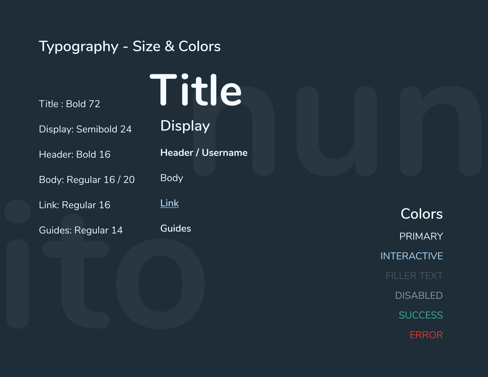
Design System
“Joy has made my life 5 times—no, 20 times— easier!”
– Kerr, front-end developer

The frontend intern and I had set up a call to discuss interactions, but as a bonus, I ended up showing him the collaborative delight of Figma—from exporting assets to inspecting CSS code.
After we spoke, I decided to put together a design system to
align myself over the course of my rapid design iterations.
support the front-end developer.
empower the team after my departure from the project.
Business
Y Combinator Application

As a pre-seed, getting funding is one of the most important parts of the process.
To support the CEO, I approached the application with a design thinking mindset.
Empathize with the YC Reader
Over 10,000 startups apply each cycle. There was no room for excess fluff in the application, so I ended up cutting the application word count by nearly half.
Define the Tone
We studied previous successful applications to get a sense of what was appealing. While the tone is not formal, we also had to be smart and professional. I buffed up the language and incorporated terminology to show we had properly invested in UX.
Ideate the Elevator Pitch
We held internal workshops to critique the application and figure out which sections were most compelling. I ended up moving complete sections around so that the value add would be more apparent.
Test! (Though we can’t iterate…)
We sent off the application and got an interview!
The essence of user experience is story-telling, and it turns out we can take that a step further—incorporating stories into the funding process was essential.
Reflection & Next Steps
Part of being a designer is being resourceful. With an initial 6-week deadline, I didn’t have the time to interact with our users as much as I wanted to.
Looking back, I would’ve wanted to:
conduct explorative & generative research to make sure that the problem we were solving was actually a problem, rather than jumping to the solution & relying on concept validation, which runs the risk of bias.
get access to analytics and quantitative metrics (where users were dropping off, which screens they spent most time on, etc.) to back up my heuristic evaluation to make more informed designed decisions.
develop empathy maps for our target users. We are not our users, even when most of the team was near-peer to them.
However, I trusted the CEO’s market research and user research, and we made the most informed decisions with the data we had available.
Though there is no way to track MAU from a prototype, we were able to track usability and aesthetic impressions. Users found the new app very modern and professional.
I look forward to seeing whether the iOS & Android apps reflect the hard work we’ve put into it.